Atlassian · 2024
Making the Confluence blank page more inviting, to drive early creation for millions of knowledge workers

My role: product design lead
Team: PM, frontend engineer, content designer, data scientist
Platform: Desktop web
Duration: 4 months
Jump to solution & impact
Problem to solve
Blank pages felt intimidating and cluttered. Confluence was leaving valuable early content creation on the table, because new and existing users preferred other tools.
Rethinking a powerful, yet outdated touchpoint
Pages are essential to Confluence’s value as a popular knowledge management and collaboration product, but new users faced significant obstacles to creating pages and understanding the wealth of content available.
Data points signaling an opportunity
We knew that ~25% of Confluence users copy and paste 2,000+ characters of content from an external source (i.e. a Google Doc) within the first 30 seconds of creating a new page. This indicated that our team was missing out on making Confluence useful for early team creation and collaboration, a key priority. I also conducted a heuristic analysis and synthesis of existing research in this domain, to clarify pain points and our opportunity.
Desired outcome: help all users unlock richer page content, during page creation
Our goal was to boost user engagement (signaled by users adding more elements and/or templates to a new page) and maintain impact weekly page creation rates per user.

Discovery
Choosing the right design principles helped inform my direction and rationalize design tradeoffs.
Gathering design principles + deciding what matters most
I consulted with our Confluence Onboarding and Editor teams to source design principles for this project, since we needed to appeal to brand-new users in addition to existing users. Since we had 10+ potential design principles available, I formed a perspective on the most applicable ones for this project and aligned with my cross-functional team and design lead on this decision.
Infuse modernity + delight into creation experience
Authentic, contextually informed moments
Clear a path by removing unneeded friction from creation
Ongoing guidance
Tailored to user needs
Potential principles
Defining MVP
I led a workshop to align my team on what will resonate with most Confluence creators, out of hundreds of ways to start.
Aligning on the best recommendations for most users
Since we had 100+ of page building blocks available for users along with 50+ templates available, I planned and led a workshop with 5 cross-functional partners to align on criteria we cared about for recommended page building blocks, as well as a perspective on the best content to recommend to users in the new experience.
Honing in on a reasonable approach, given new constraints
New constraints, given limited engineering resources available to dedicate to our project:
Solution must work for any Confluence user creating a new page (whether it’s their first time or not)
No changes to template selection flow, due to massive LOE and reliance on a partner team.
Result: focused design requirements for MVP
As a result, we felt confident in recommending 3 specific content building blocks + templates that were grounded in broad user appeal and current usage data.






Learning & iterating
After our MVP experiment failed, I shifted our design approach to emphasize subtle helpfulness.
Launching a constrained MVP to fail fast
Unexpected constraints limited the flexibility of our first experiment, but we decided to launch and learn with a limited customer cohort, due to low predicted customer risk.
Valuable insight: too much help gets in the user’s way
After about 5 weeks, this experiment hurt weekly page creation rates by 1%, and we received negative customer feedback, so we turned it off and went back to revisit our project goals.
“Get this out of my way!”
- customer feedback via in-product collector

Constraint: could not change or move the /ai prompt
Re-orienting around learnings & starting fresh
After discussing MVP learnings with my team, I re-kicked off the design of the experience, focusing on providing guidance to Confluence creators without getting in the way of writing or pasting content into a page. The benefit of our failed MVP is that we got buy-in from leadership to change the entire UX and break through our prior product and engineering constraints.
Delivery
I weaved in usability enhancements and navigated late-breaking product asks, ensuring that Confluence creators get the best possible experience.
Enhancing usability with undo
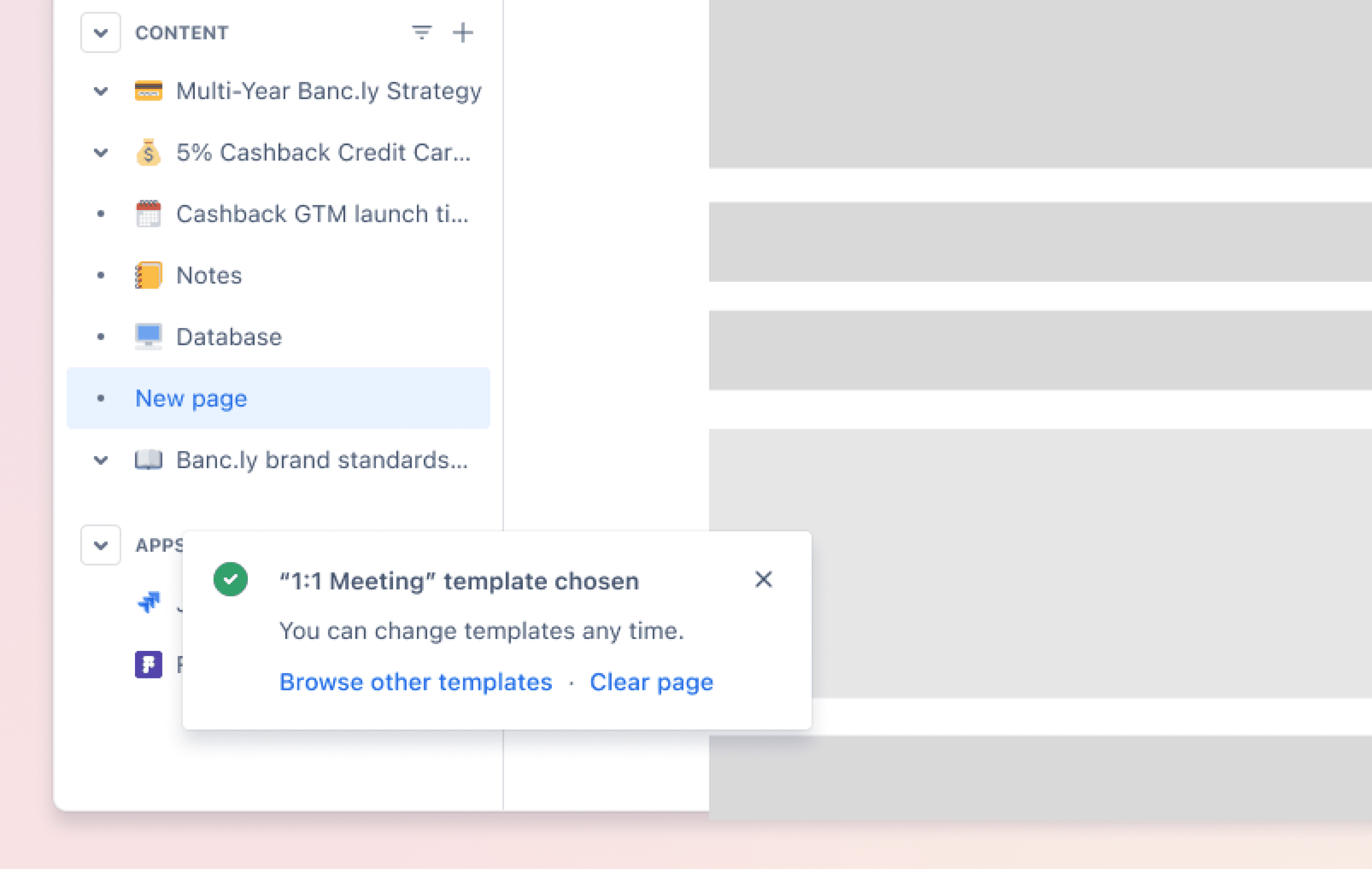
Once users chose a page template, there was no easy way to go back and choose another - the workaround was clunky and unintuitive, discouraging users from exploring templates.
To solve for this, I advocated for a new feature allowing users to easily undo their template choice and go back to browsing, and collaborated with our team’s content designer on the copy. This made the overall experience more robust and let users try adding things to their page with an easy way to go back.
New undo ability: “Clear page” gave page editors an easy way to go back and try other templates
Incorporating AI tools strategically
Midway through design work, product leadership asked us to incorporate a variation with a new AI feature. To do this in a sensible way, I met with our AI product design lead and reviewed existing research insights to choose an appropriate entry point in the midst of other suggested content inside the blank page. I landed on recommending the new Brainstorm with AI feature, since it was most suitable for early content creation compared to other AI content tools available.
Solution overview
The new experience streamlined the blank page creation moment for all Confluence creators, providing quick and subtle ways to start creating content.
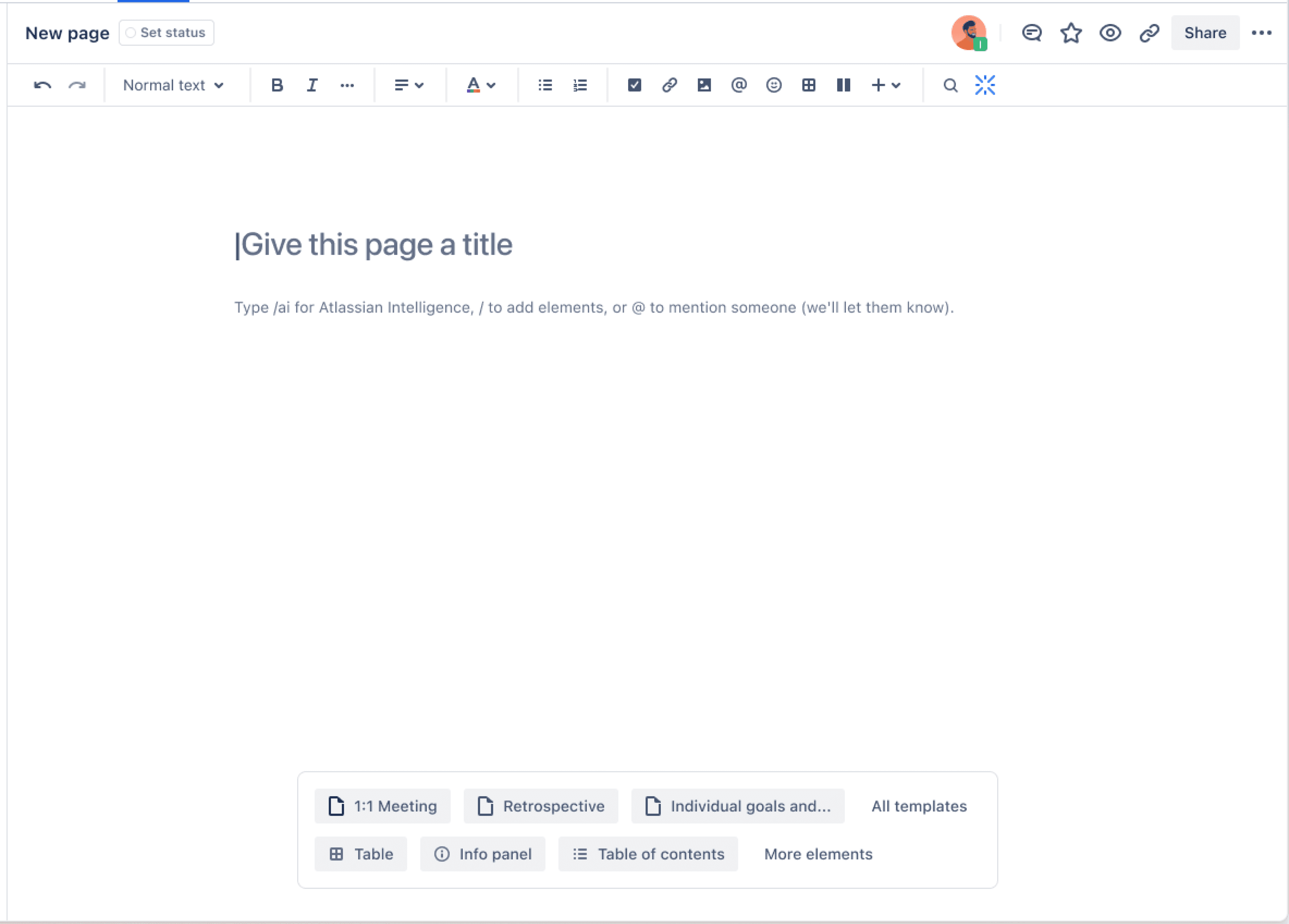
Key journey #1: Confluence creator starts a blank page with a template
Key journey #2: Confluence creator starts a blank page with an element
Impact
We drove a 5% increase in users adding elements to their pages, and I generated a learning plan to enhance our future tailored experiences, tying to a long-term vision.
5%
Increase in average # of elements added to new Confluence pages
2%
Increase in page creation rates, month over month (recovered from MVP dip)
Promising early impact on creation
When we rolled out the full new blank page experience (spread across 3 milestones), our team saw a statistically significant 5% increase in users adding elements to their new pages, which directly impacted our team’s OKR. We also recovered page creation rates from the MVP experiment, and user complaints regarding the MVP disappeared.
Next steps: exploring new research, and enhancing the broader creation journey
We knew from existing research that user motivations to create pages are complex and also relate to privacy and job role, so for next steps, I created a qualitative research plan to see if we can uncover new ways to drive creation through this experience.
Surprising lack of impact on template use - signal to explore further
We were surprised that we didn’t change template usage rates with this experiment - this was a signal that we needed to try other tactics to drive template adoption. I created concepts for improving the template browsing experience (part of the user creation journey) which was outside the scope for this project, and I connected with our Confluence templates team to influence their future improvements in this domain.

Learnings and reflections
This project helped our team modernize the blank page moment, and also laid the foundation to move closer to our product vision of transforming teamwork.
The allure of a quick win vs. achieving deeper impact
One of the key challenges of this project, was that early on we were scoped to a small engineering level of effort, and due to repercussions from an internal reorg, we were not able to change as much about the current experience as we had hoped. We focused on quick wins with our MVP and subsequent releases, rather than a broader overhaul of the creation journey. To continue making impact in this space, I advocated for my team to focus on improving the experience more holistically, via a visioning workshop.