designing a cohesive web-based tool suite
internship at Intel | May - Aug 2015 (3 months)
My engineering team maintained Datos, a high-profile product life cycle (PLC) data tool suite. While Datos had high business value, there were various opportunities for improved design + experience for its users.
A variety of employees view and track crucial data throughout the PLC using Datos, primarily from their laptops and desktop machines.
|
PROBLEM SPACE
I was responsible for evaluating the current design weaknesses of Datos, and providing recommendations and updated UI designs for each major tool, along with the overarching navigation and Datos branding. The core challenges were:
|
process + my roles | heuristic evaluation + information architecture + UI design
exploring + analyzing current environment
|
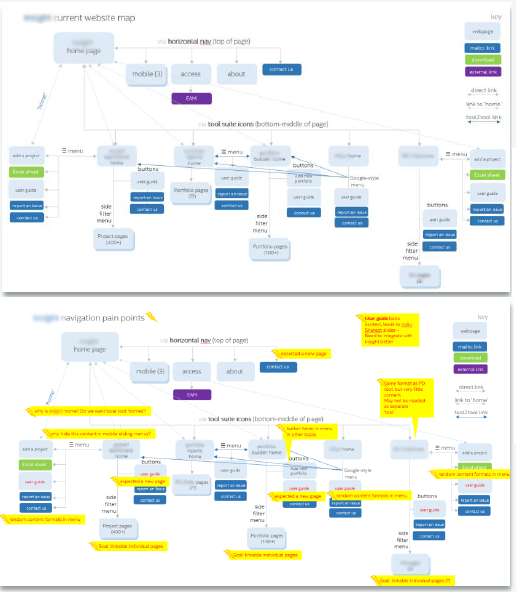
identifying navigational needsI documented pain points and inconsistencies in navigation across the entire tool suite, and presented this site map to my team - showcasing the need to create a consistent navigation pattern between tools, which became a core project in the following month.
|
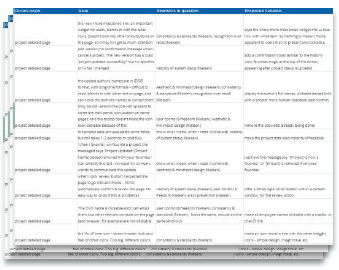
performing heuristic evaluations + prioritizing updatesAfter exploring the overall system, I performed detailed heuristic analyses on each of the Datos tools, documenting and elaborating on specific design issues. I used Nielsen's heuristics, along with the Android Design Principles, as my guide. I presented these heuristic reports and gave input on design priorities to my project manager.
After each heuristic evaluation, my PM and I formed action plans for improvements to each specific tool UI, aligning with business needs and development resources. |
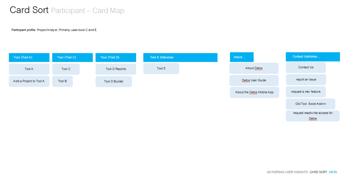
researching + designing a global navigationAlthough I had identified navigational issues, I didn't have enough research to inform a global navigation structure. Since my projects were centered around UI design, I advocated for a small information design activity to my team, pitching the importance of getting insights from real Datos users in order to make a sensible global navigation for the tool suite.
After successfully persuading my team to allocate resources, I conducted a card sort with three Datos users. I created diagrams of their content models, and presented core recommendations and findings back to my team. |
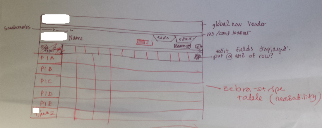
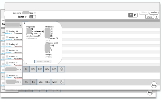
iterating towards cleaner, more sensible UIsFocusing on one tool at a time, I sketched alternate UI layouts and visual elements. I aimed to better support a cohesive look + feel across the tool suite, and make essential content more findable and interactions more intuitive for tool users. I worked closely with my project manager to refine these designs in line with the business logic and values of the organization.
I sketched and mocked up global navigation menu structures and interactions and presented frequently to my project manager. I drew from Android design principles, my organization's preference, along with navigational best practices for laptop-based web experiences to inform my interaction flows and UI layouts. I discussed interactions and UI details with a developer, on topics such as click/hover differences for UI elements. |
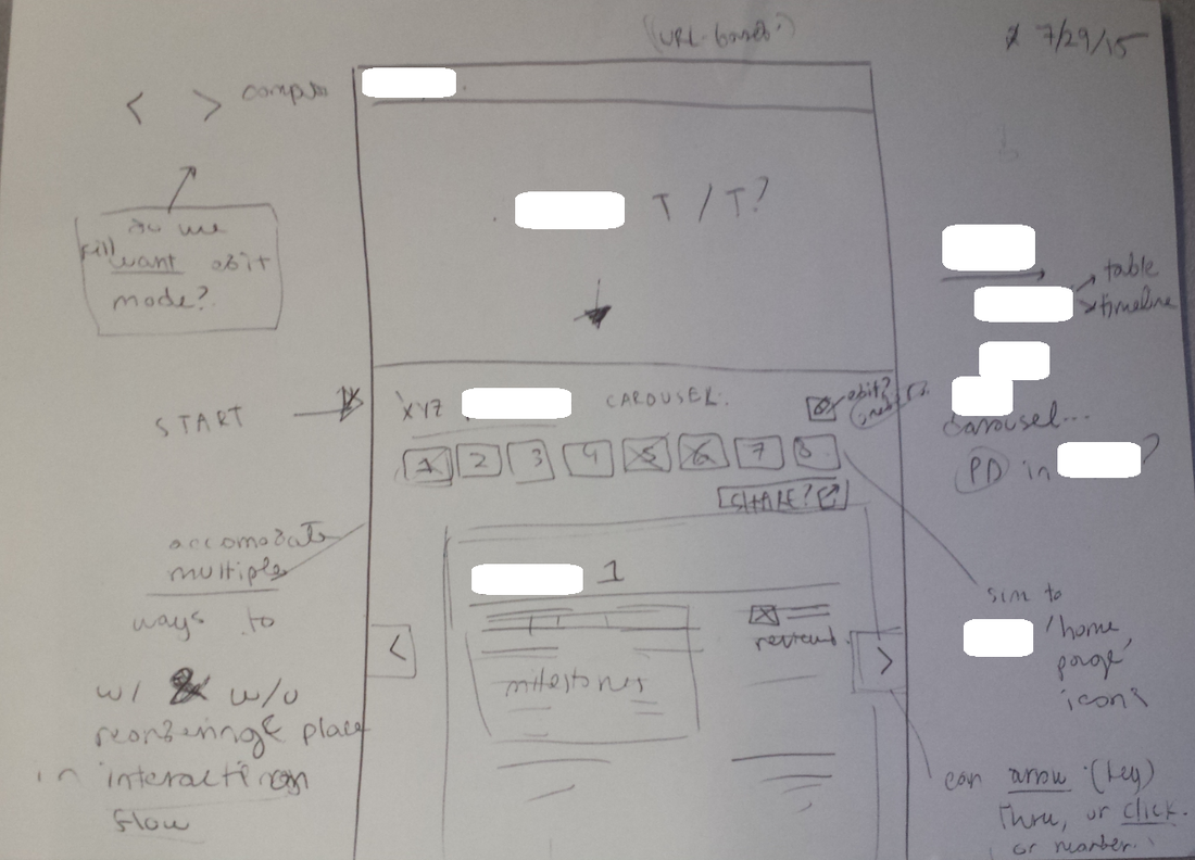
envisioning future tools + creating visual assetsDeeper into my internship, my senior manager and project manager shared their visions for novel tools to add to Datos. From conversations and quick whiteboard sketches, I fleshed out potential interface designs and interactions, and mocked up proof of concepts for two new tools.
I also sketched and created fresh icon designs for a next-generation tool, per my senior manager's vision for the tool and the growing design guidelines for Datos. |
results + takeaways
"It's the Rolls Royce of Filter Menus. "
- web developer on my team, on an updated filter menu I designed
|
This summer was an immersive, informative experience. In only 12 weeks, I was able to tackle and resolve multiple UI and UX-related challenges for my small, close-knit team.
As I was the only UX-oriented person on my team of developers and analysts, this internship drove home the importance of being able to share and defend my designs to different audiences. I appreciated working closely with my project manager and senior manager, and receiving honest feedback and input along the entire process. It was exciting working with the developers too, and seeing them bring static designs to life on our website.
I also learned that cutting-edge tools are not a pre-requisite for communicating designs - my best presentations and mockups were all finalized in Powerpoint! |
By the end of the summer, these are the things I accomplished:
|